Kashish
Joseph
Naidu
📍 Sydney, AU

MakeMyTrip

MakeMyTrip (MMT) is India’s premier online travel booking platform (flights, hotels, rail tickets, and holiday packages). MMT sought to convert its massive traveler audience into an active creator ecosystem.

‍

Two sides, one system: context and ownership

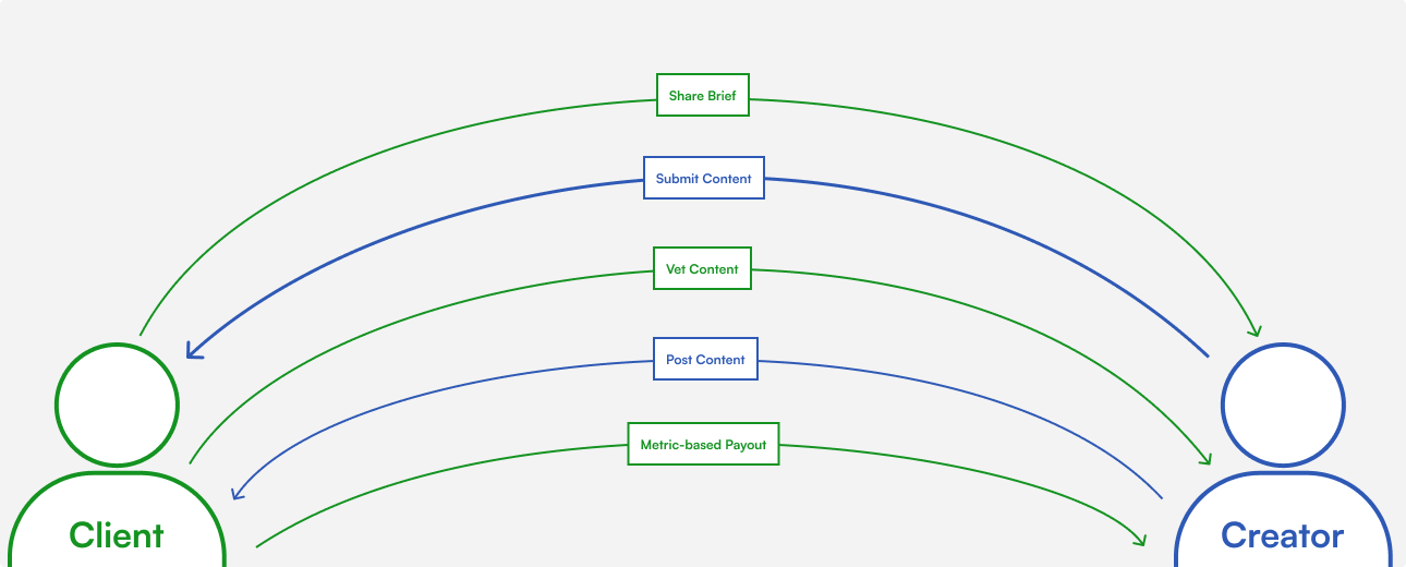
MMT wanted to turn its traveler base into a creator network and rely less on paid agencies. The platform had two jobs: make it easy for creators to find and complete branded briefs, and give MMT control over quality, compliance and payouts. Creators, through campaign managers, wanted clear rules, scannable briefs and predictable payouts. MMT wanted campaign-specific content, strict deliverable checks and unambiguous payout rules.

‍

What I owned: the creator-facing web-view (onboarding, brief discovery and detail pages, submission tracking, earnings and bank setup) and the content structure of the briefs.‍

‍

What I didn’t: the PRDs (written by Galleri5’s product leads), the admin tools, the earnings formula, the 30-day payout window, and the mandatory Instagram connection. I didn’t speak with creators directly.
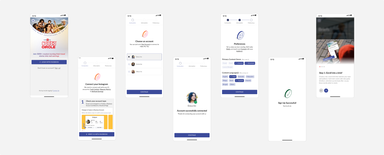
Week one: core flows from a template

MMT needed proper UI fast. I started from a design system template with pre-made styles and re-skinned it to MMT’s typography, spacing and color tokens, then designed flows and screens together. The core flows reached the client within a week. The trade-off was little upfront exploration, so refinement came from feedback.

‍

That feedback came in two waves. After the first review, MMT’s business team asked for a first-time intro. After launch, creators’ questions to the campaign team drove a rewrite of the brief pages. The reiteration of the brief page has been covered below.

Mapping every state with NotebookLM

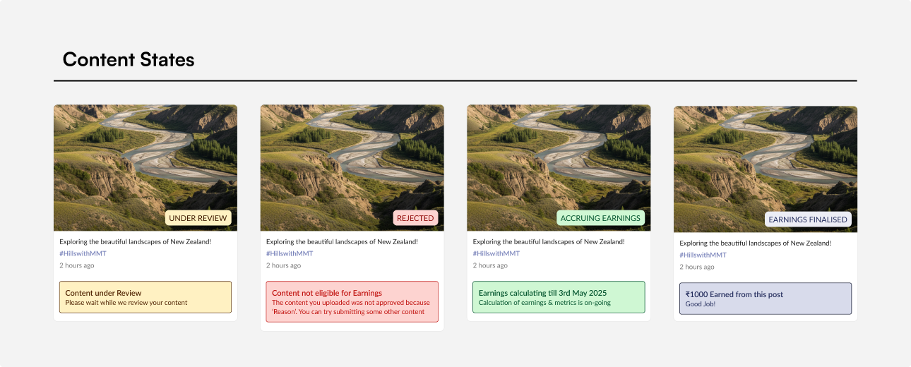
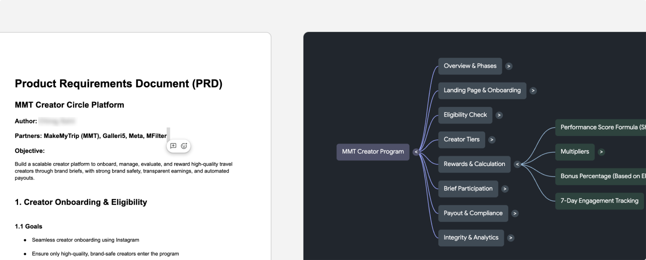
The program had many possible content and brief states: draft, in review, expired, resubmitted and so on. I gave NotebookLM the PRD and the program logic document and used it to list every state that could occur. I then got the list validated by producted and used it as a checklist when designing screens and error handling, so nothing surfaced for the first time in development.

‍

It was a completeness aid, not a source of truth. The design decisions in the next section are still mine.

Three hurdles: designing inside decisions I didn’t make

Most of the hard calls on this project were someone else’s. What I controlled was how they landed on the screen.

‍

1. Brief pages: content, not just layout

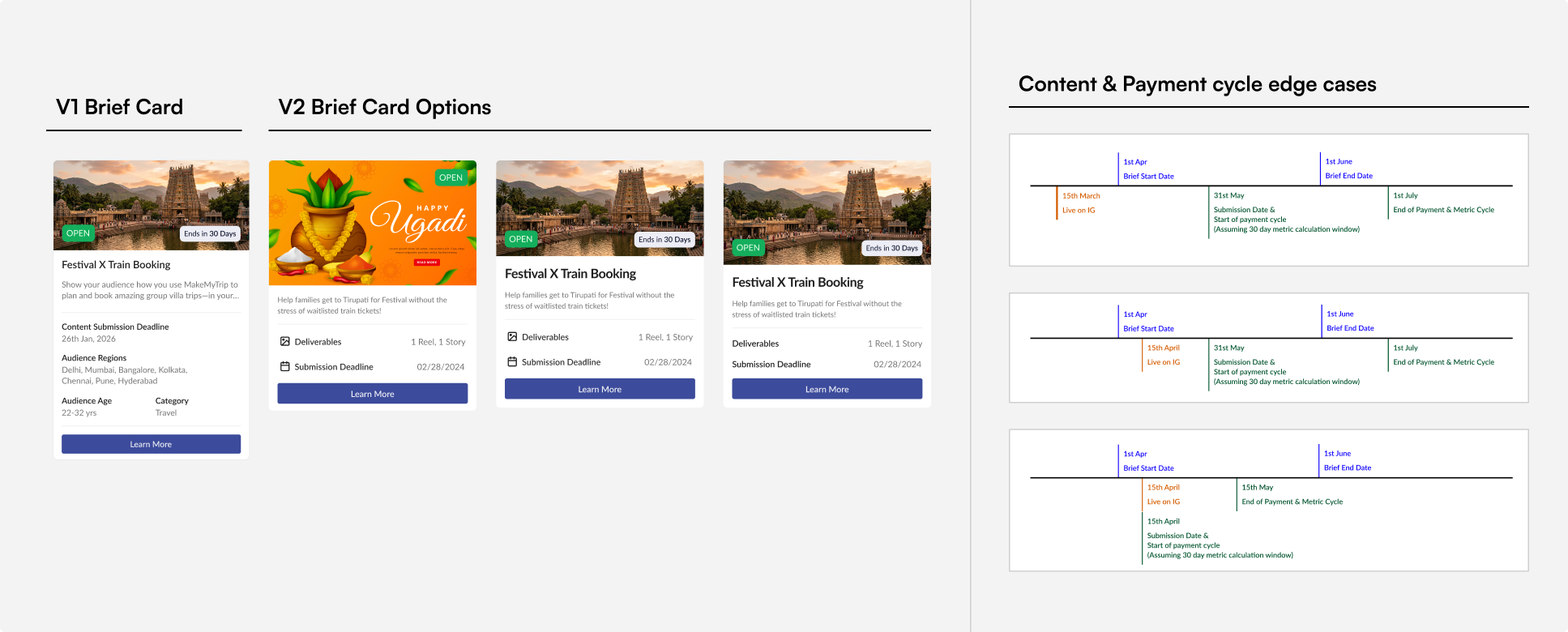
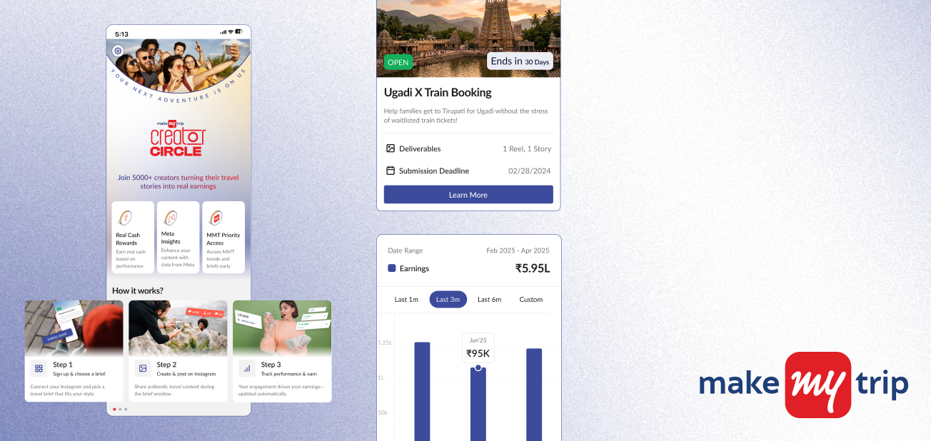
  • The Context: Brand stakeholders wanted every rule visible upfront to prevent disputes. Once creators started using the briefs, they sent many questions to Galleri5’s campaign team, a sign the briefs weren’t communicating. I sided with the creators. v1 was one long scroll of ten-plus blocks at equal weight, with audience details mixed in among what creators had to do.
  • Design Decision: v2 regroups it into three task-based sections: what you need to do, how you get paid, and content guidelines (points to mention with suggested wording, plus do’s and don’ts). I also proposed character limits for the text the campaign team feeds in through the backend, and asked them to rank what creators most needed to know, then designed in that order. The cost is that nesting detail means some creators will skip rules, and I don’t have before and after numbers on how many questions dropped.

‍

2. Explaining complex formulas & timelines for payouts

  • The Challenge: Payouts followed a weighted formula (likes and comments count for more than views) and a 30-day window after publishing. Both were MMT’s decisions and creators need
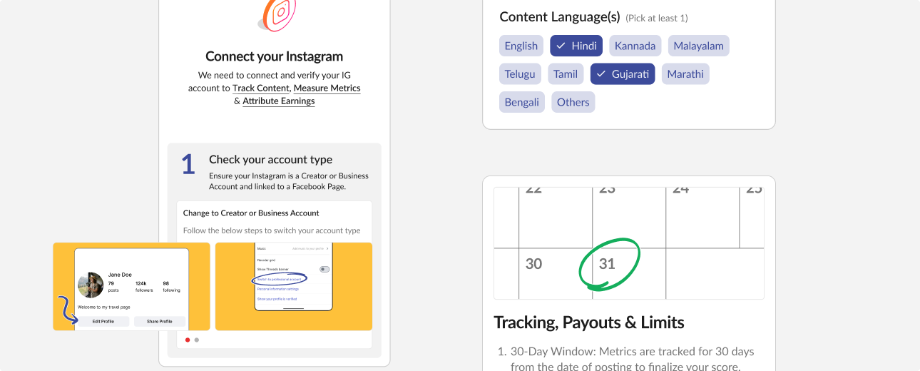
  • Design Decision: I made a very concious decision: every screen talking about content, payments and performance had to explain to  earning metrics and a countdown to when earnings are finalised. The deadline rules were also business-driven. For example, Submit is disabled when a brief closes, posts "Under Review" at expiry are marked “Brief Has Expired,” and nothing is paid after expiry. Finer nuances with respect to Rejection and Metrics also needed to be explained at every point. The team already knew the main risks, including formula gaming and payout disputes, and those sat in the product and admin layer outside my scope.

‍

3. Mandatory Instagram connection

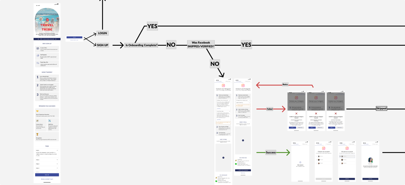
  • The Challenge: Galleri5’s platform needed Instagram API access to read engagement data. On Shein, I recommended making the connection optional, because earlier Galleri5 programs lost roughly half of users when it was required upfront. MMT chose mandatory.
  • Design Decision: I couldn’t change that, so I designed for failure: recovery screens for connection errors, API retry states and multi-account selection, so a creator who hits a Meta error isn’t stuck at the door. I don’t have data on how many creators dropped at this step, so I can’t say whether it filtered for intent or turned away good creators.

What went live and what didn’t

Shipped in v1

  • Onboarding with a three-step first-time intro, added after MMT’s business team reviewed the week-one UI
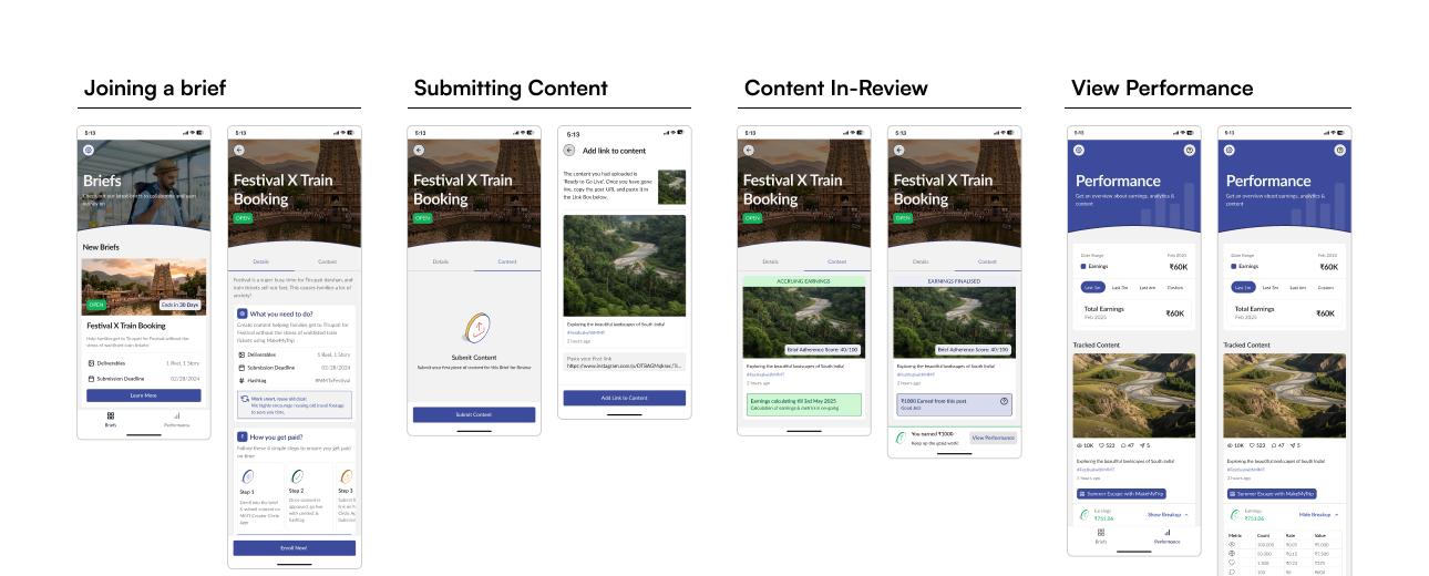
  • Brief discovery and detail pages (the v2 structure)
  • A submission tracker with resubmission for rejected content
  • A performance page with the weighted-metric breakdown, a 30-day payout timer
  • A bank setup & KYC Page

Deferred or cut:

  • Guided walkthroughs, animated tooltips and interactive micro-tours. The static intro and contextual copy shipped, but the interactive layer was cut for launch timelines.
  • Draft saving, with the cost to creators described above.
  • Anything on the admin side, which wasn’t mine to design.

Outcome and reflection

Program results (first six months, not design outcomes)

  • ‍ ₹6 crore was paid to creators, which is MMT’s spend, I don’t have return data.
  • Creator content drew 60M+ views.
  • 1,200 creators joined, and 90% of them enrolled in at least one brief.
  • The program averaged 700+ monthly enrollments and 500+ submissions.

V1 launched in January and I left in March 2026, so part of this window falls after my involvement.

‍

What I took from it

  • Content is part of the design. The biggest gain in the briefs came from changing what the campaign team wrote and how it was ordered, not from restyling the page.
  • Complex rules need in-app education. The intro covers the journey, but the 30-day wait and weighted formula are harder to grasp, and the interactive guidance I wanted was deferred.
  • Second-hand feedback hides friction. Campaign-manager summaries gave direction, but not what creators struggle with.
  • Starting from a template buys speed but leaves the sub-brand without its own design language.

What I’d test next

Instagram connect drop-off, whether creators read the rules, submissions lost at the deadline (and whether drafts or a warning help), whether creators understand the 30-day wait, and observed sessions with five or six creators.

Discover my other work

Discover my other work

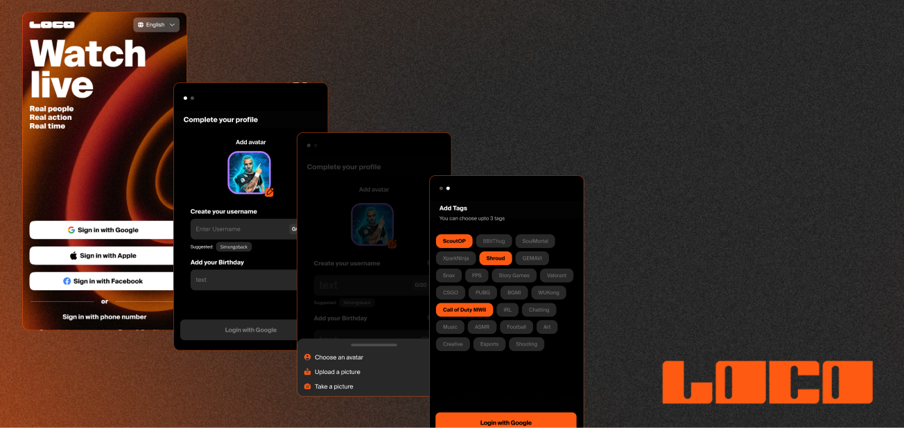
Loco.com

Simplified new-user onboarding for a live-streaming app during a global expansion and full app refresh.
Read more